Yellow
Boots
YellowBoots
Brief
Rebrand a gardening-focused service with a bold, friendly identity and recognisable visual elements
Approach
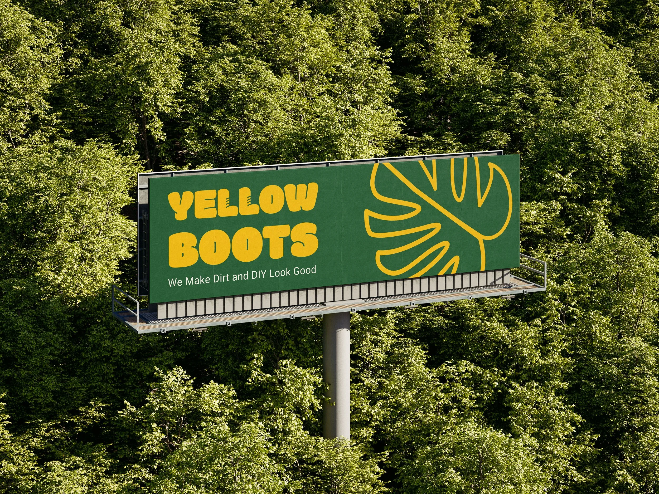
Create examples showing how the branding, elements, and colours can be applied across different uses
Outcome
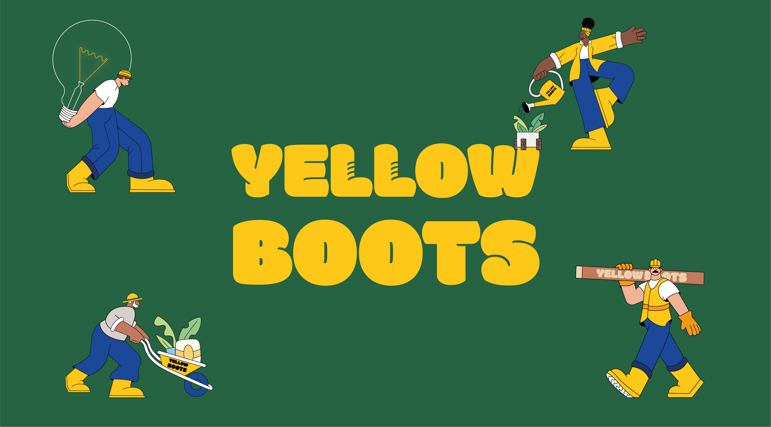
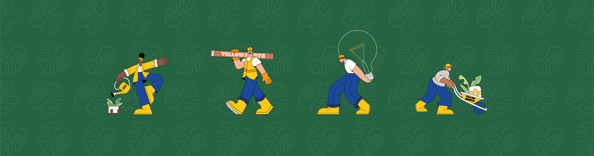
Redesign the logo, brand elements, and colour palette to create a cohesive visual identity
Brief
I was approached to rebrand a handyman business that provides
a wide range of services, such as joinery, electrics, and maintenance, with gardening at its core. The client wanted a fresh identity that would cut through the competition and position them more clearly
in the market. While gardening needed to be highlighted as the main focus, it was also important that the branding reflected the full scope of their skills and services.
Approach


I started the design process by sketching a range of brand elements to explore visual possibilities. These sketches were then developed digitally, where I tested various colour combinations to find a palette that aligned with the brand’s identity. After narrowing down the strongest concepts, I refined and finalised them in Illustrator,
ensuring each element was clean, balanced, and ready for
practical application.


Outcome


The updated branding features a redesigned logo, custom graphics, and a fresh colour palette that highlight the business’s approachable, hands-on nature. With a stronger focus on gardening, the new identity feels cohesive across print and digital, reinforced through mock-ups that showcase its adaptability across various materials.