The Jersey Tree
Company
The Jersey Tree
Company
Brief
Create a visual identity
for a family run farm
Approach
Create a brand identity that reflects
the family connection.
Outcome
Design a versatile logo suitable
for the whole farm.
Brief
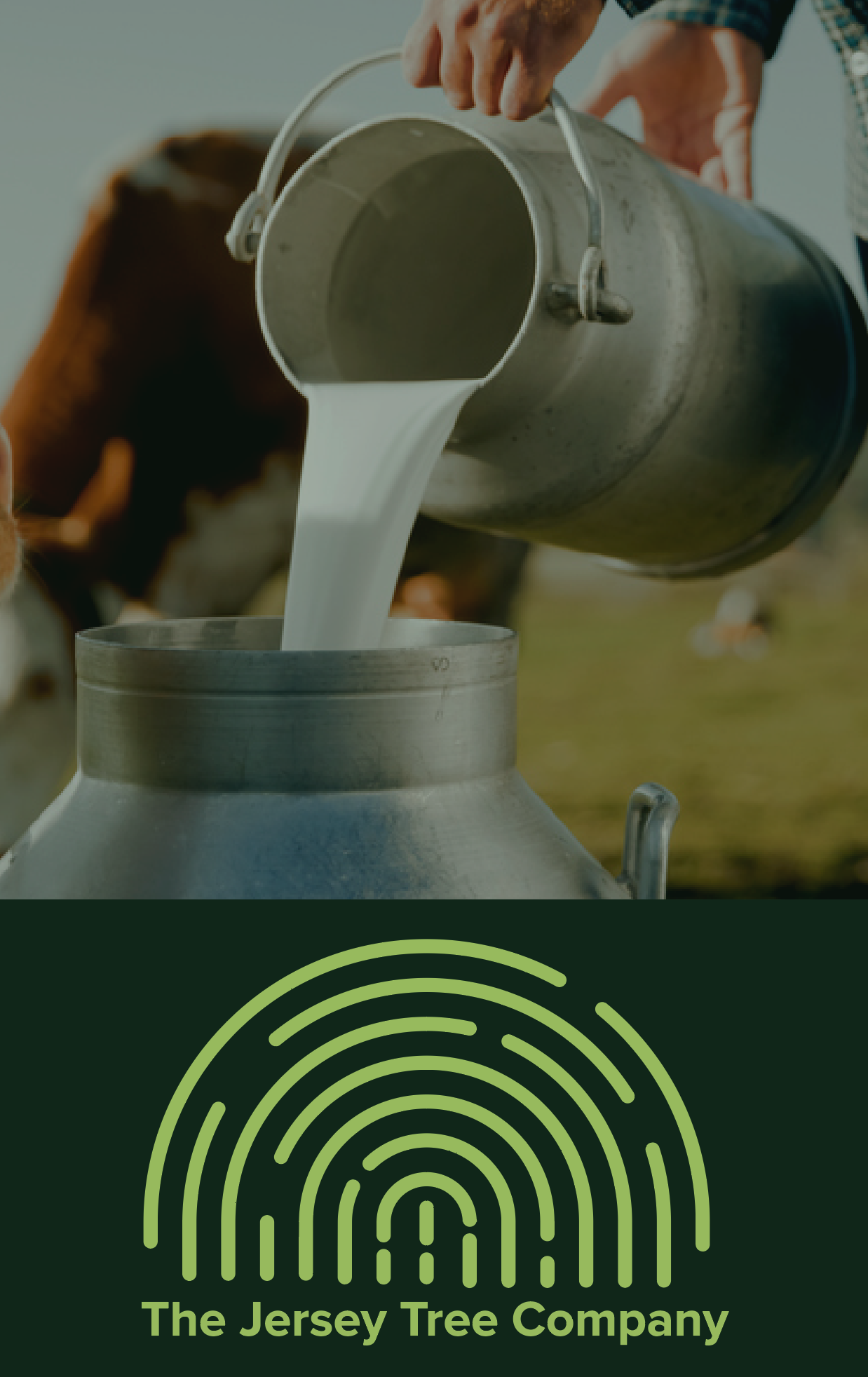
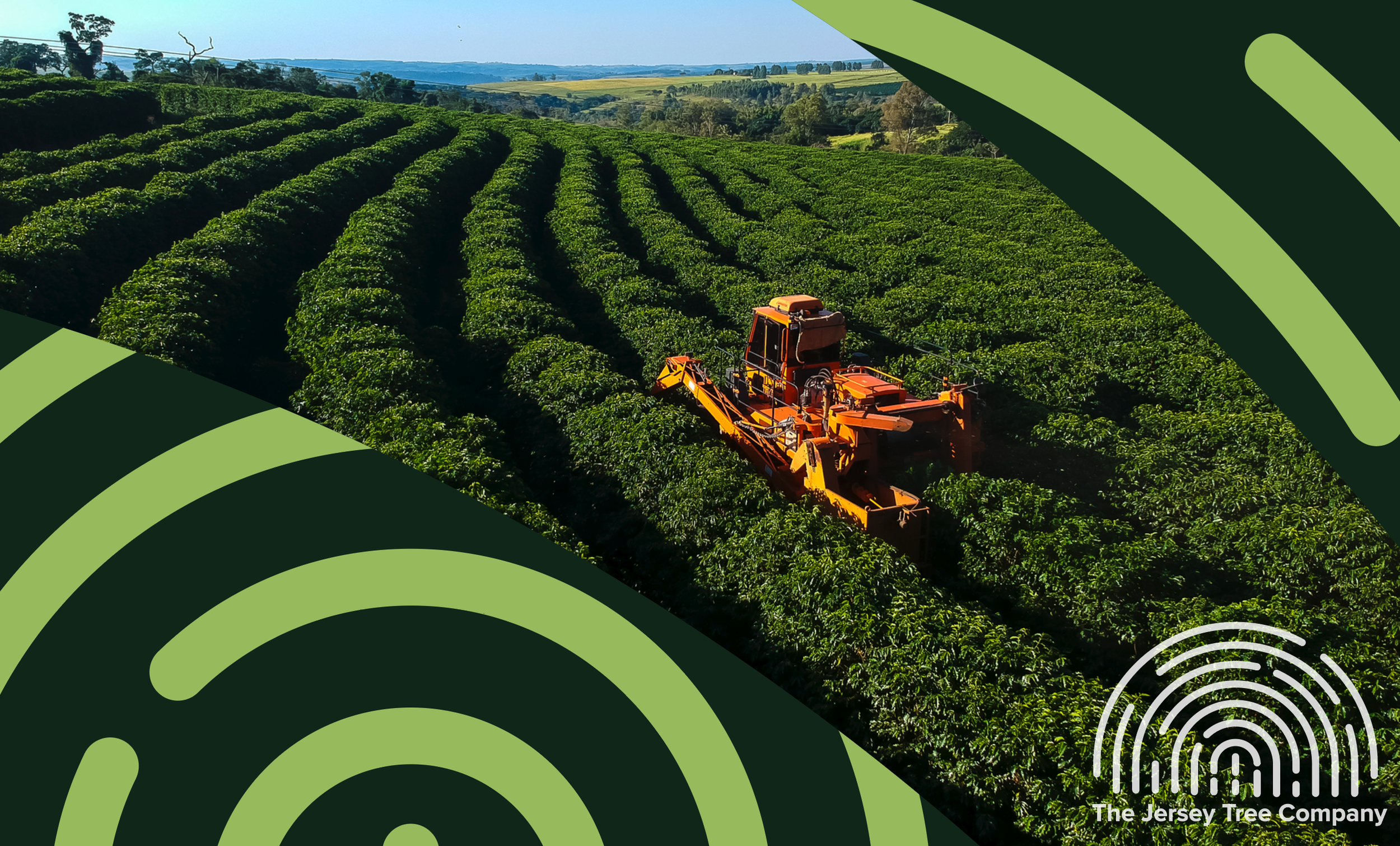
I was approached to create a visual identity for a family run farm with deep roots in traditional farming. They are known for growing avocados, mangos, and macadamia nuts, while also producing their own honey and, most importantly, fresh Jersey milk. The brand needed to capture both the diversity of their produce and the warmth of their family values.

Approach


I was inspired by the idea of using a fingerprint as a symbol of individuality, connection, and heritage. A fingerprint is unique to each person, much like the farm’s identity and the generations that have nurtured it. Visually, its lines mirror the organic patterns found in tree bark and growth rings, reinforcing the bond with nature. This concept not only connects to the land but also reflects the farm’s deep-rooted story, creating a mark that feels personal, authentic, and timeless.


Outcome

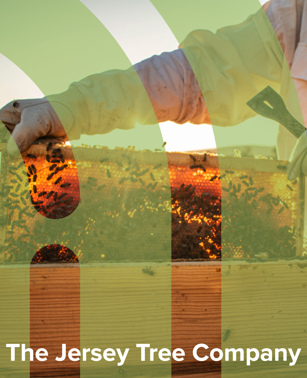
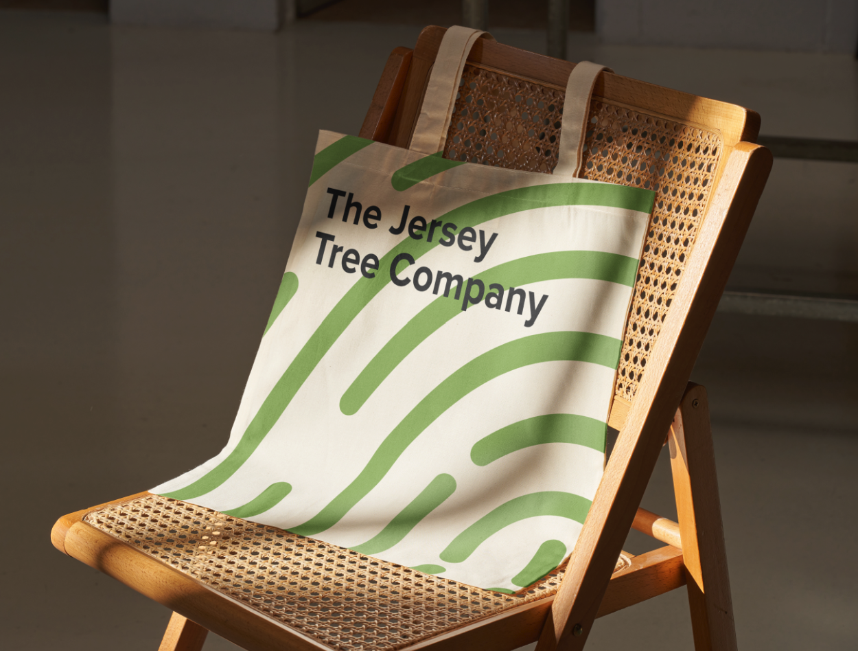
I based the design on a fingerprint, a symbol of individuality and uniqueness that also subtly reflects the natural texture of tree bark. This connection between personal identity and the natural world provided a meaningful way to represent both the people and the land behind the farm. The colour palette draws on soft, varied shades of green, evoking the calm,
fresh tones of the outdoors and reinforcing the link to nature.