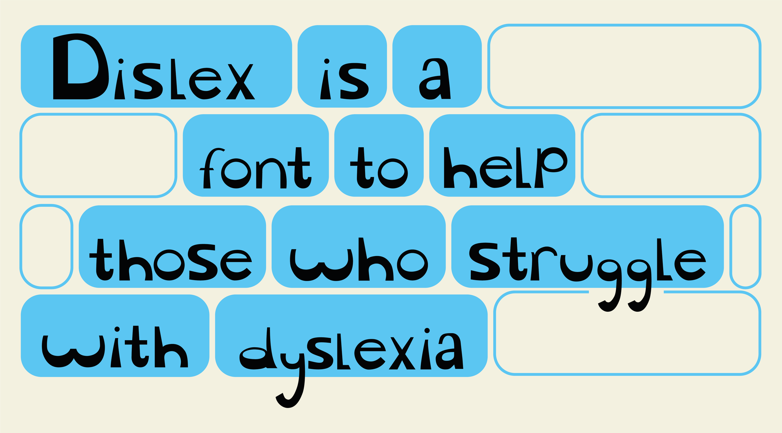
Dislex
The font that will
help with dyslexia
Brief
Design a typeface that could
be used to help others who
struggle with dyslexia
Approach
Compare typefaces that are
difficult versus easier to read
for dyslexic people
Research
Find out why dyslexic
people struggle with
certain typefaces
Outcome
Have a full typeset
that can be used to help
with dyslexia
Brief
Design a typeface specifically aimed at improving readability for individuals who struggle with dyslexia. The goal was to create a typeface which helps reduce common reading barriers, enhance clarity, and provide a more accessible reading experience. This typeface seeks to support better comprehension and ease of use across various digital and print formats, helping to make written communication more inclusive.
Approach
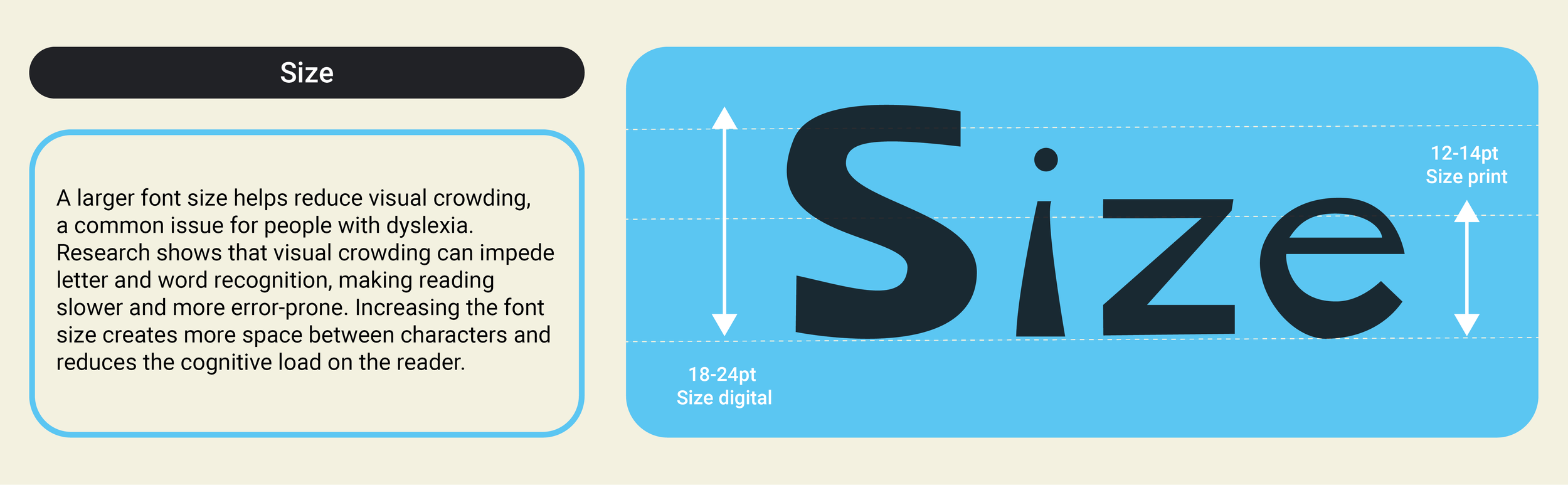
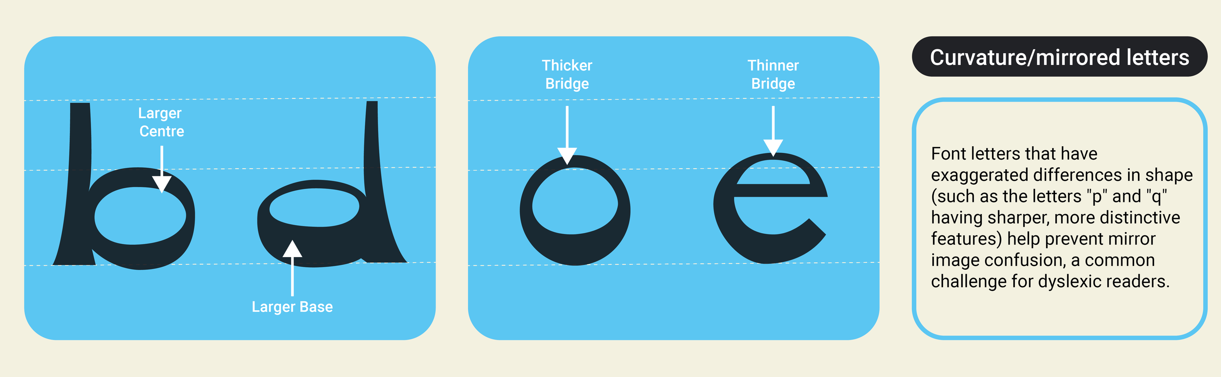
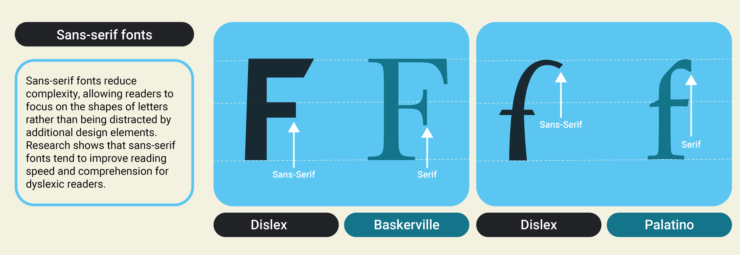
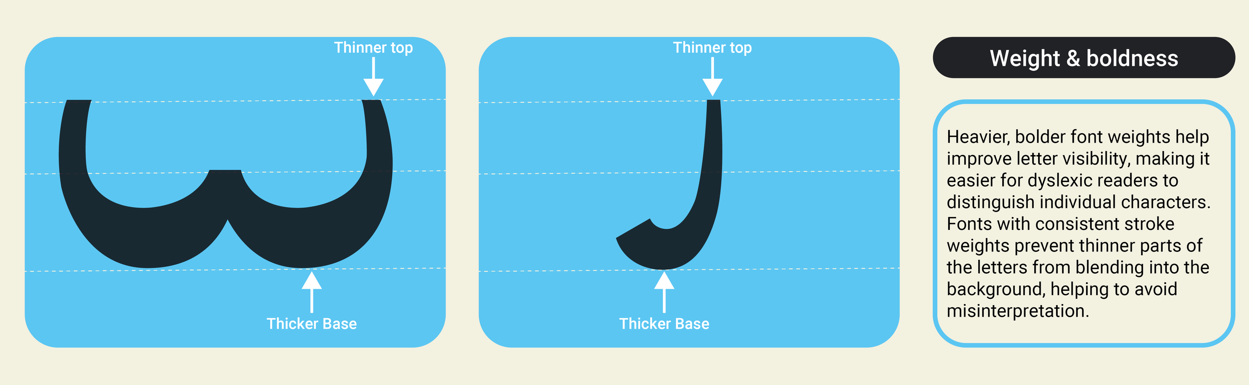
Compare typefaces that are challenging for people with dyslexia to read with those that offer better readability. This involved analysing specific design features such as letter spacing, shape, and weight to understand what makes certain fonts more accessible. The aim was to identify key characteristics that improve reading ease and to inform the creation of a more dyslexia-friendly typeface.

Research
Investigate the reasons why people with dyslexia find certain typefaces difficult to read. This involved exploring how specific
letter shapes, spacing, and styles can cause confusion or slow
down reading. Understanding these challenges helped identify
which design elements to avoid and guided the development
of a typeface that improves readability and reduces visual stress
for dyslexic readers.
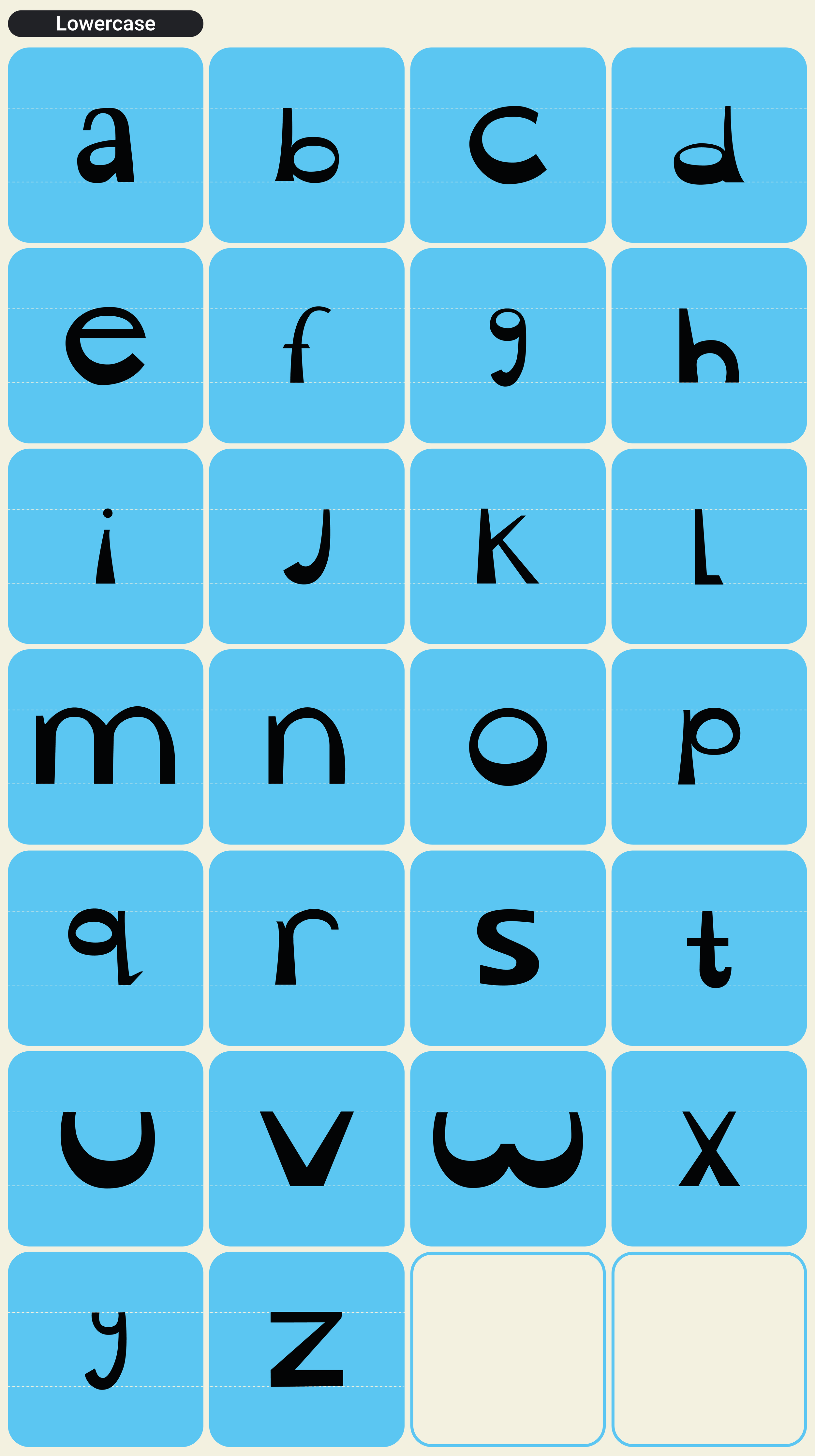
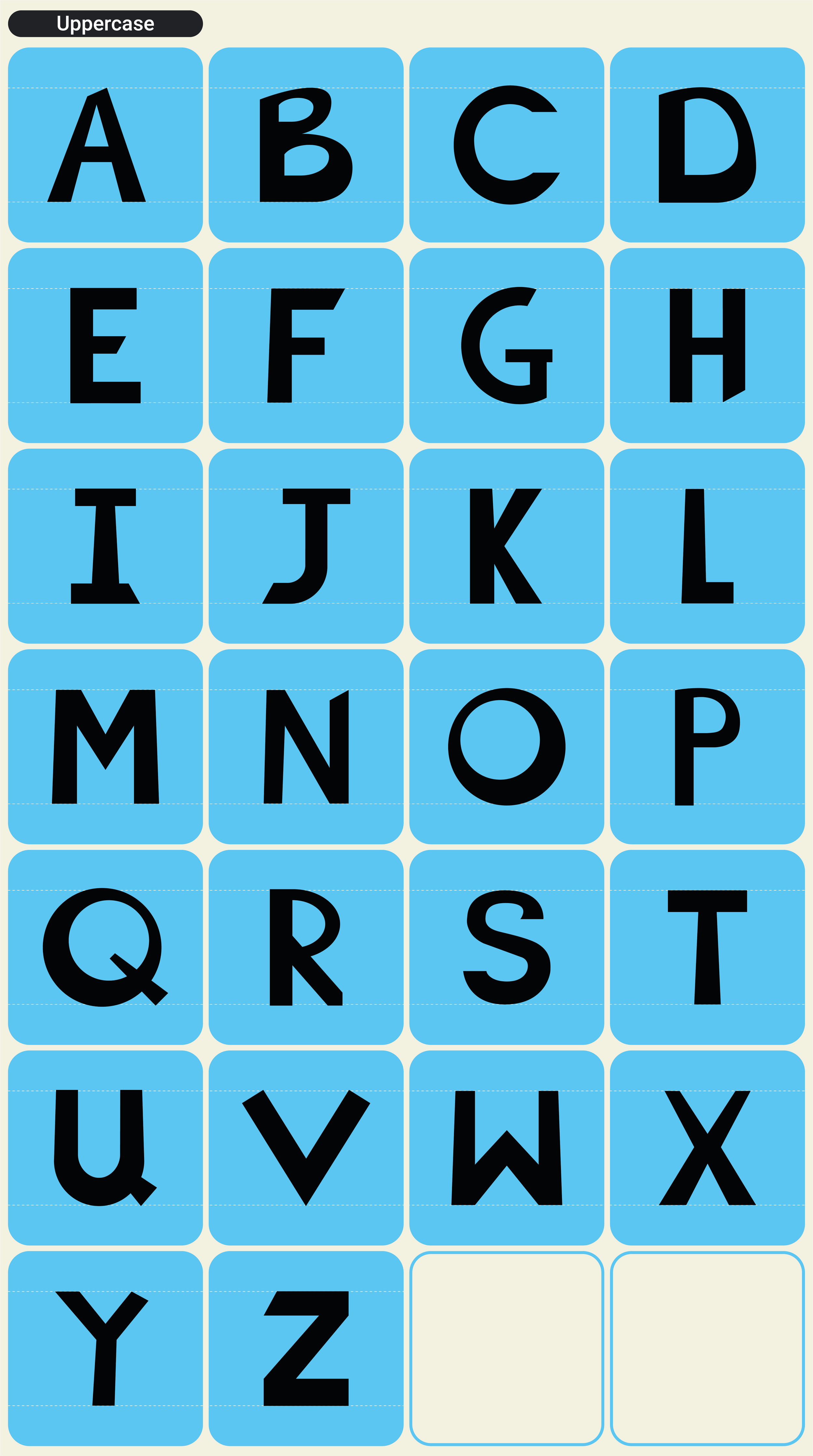
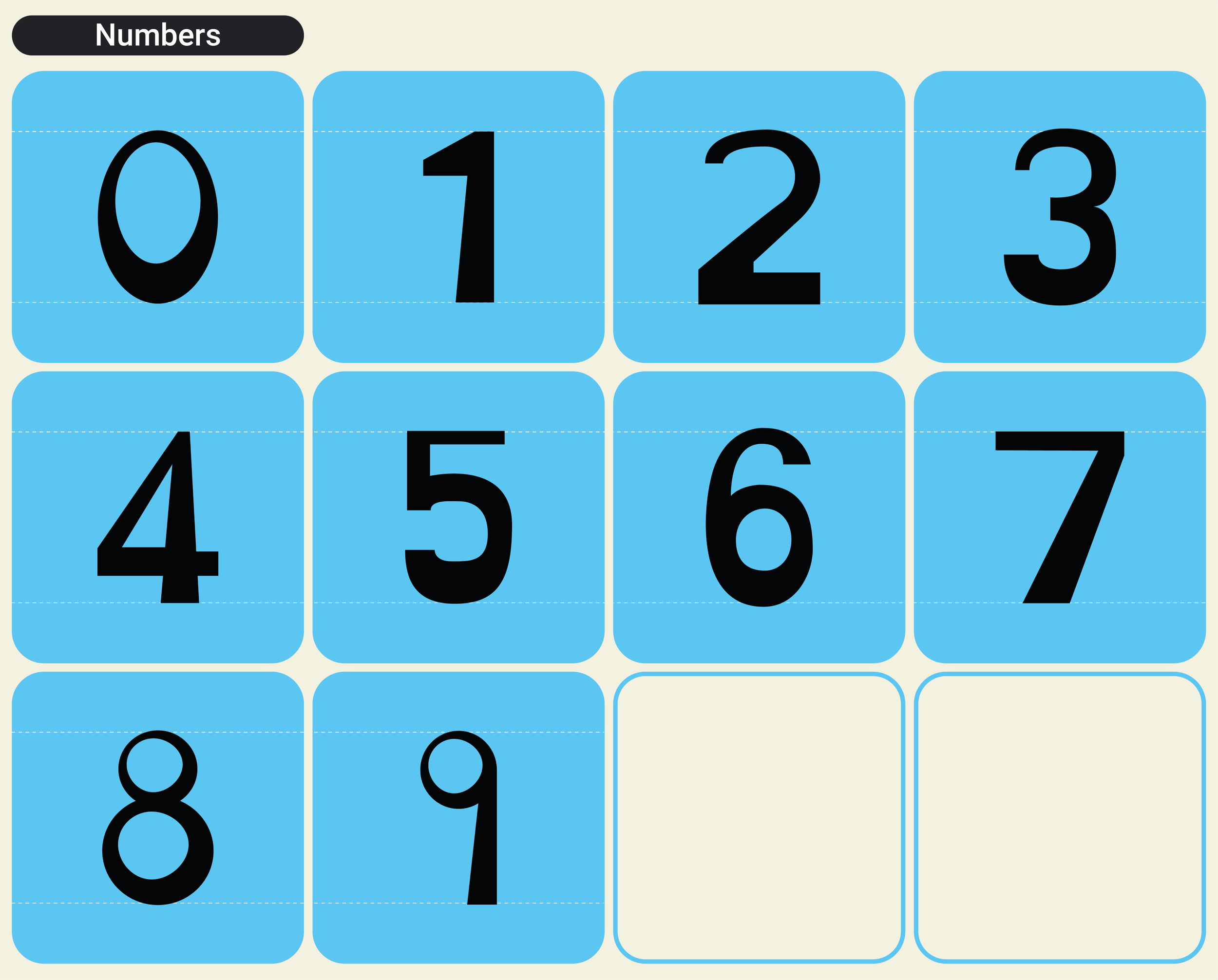
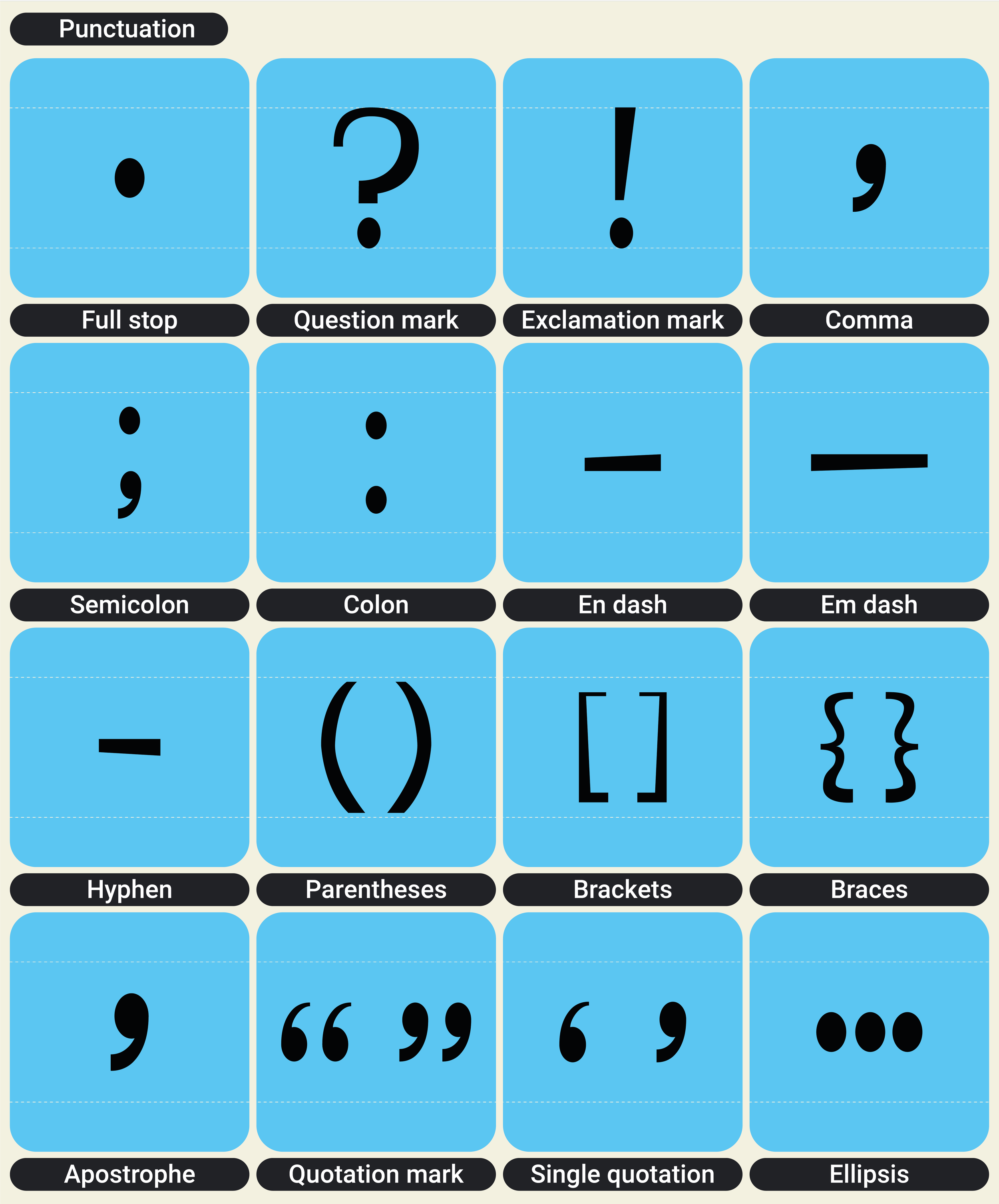
Outcome
I developed a complete typeset designed to support readers with dyslexia. This includes a full set of carefully crafted letters, numbers, and symbols that incorporate design features aimed at improving legibility and reducing reading fatigue. The typeset is intended for use across various platforms, ensuring accessibility and ease of reading
in both digital and print formats.